IBM Replaced Helvetica with IBM Plex
location, 31, Epping Road, Double Bay, Eastern Suburbs, Sydney, New South Wales, 2028, Australia
Corporate Branding
Typography
Design History
3 min read
Updated By: History Editorial Network (HEN)
Published:
Updated:
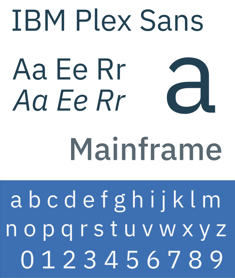
IBM utilized Helvetica as its corporate typeface for a duration of five decades, establishing a strong visual identity that resonated with its brand values and corporate messaging. Helvetica, known for its clean and modern aesthetic, was widely adopted in various IBM communications, including advertisements and product packaging. The typeface became synonymous with the IBM brand, contributing to its recognition and consistency across global markets. However, as design trends evolved and the need for a more distinctive and versatile typeface emerged, IBM decided to transition from Helvetica to a custom-designed typeface named IBM Plex. This decision was part of a broader strategy to modernize the brand's visual identity and enhance its digital presence. IBM Plex was developed to reflect the company's commitment to innovation and to provide a more tailored solution that could adapt to various digital platforms and applications. The new typeface was designed to be more legible and functional, catering to the diverse needs of IBM's global audience while maintaining a cohesive brand image. The introduction of IBM Plex marked a significant shift in the company's branding strategy, allowing for greater flexibility in design and communication.
#mooflife
#MomentOfLife
#Ibm
#Helvetica
#IbmPlex
#CorporateTypeface
#BrandIdentity
Primary Reference
IBM has freed itself from the tyranny of Helvetica

Explore the Life Moments of