
ABBA's Iconic Reversed 'B' Logo: Symbolic Branding for Global Popularity.
Sweden
Entertainment
Business
5 min read
Updated By: History Editorial Network (HEN)
Published:
Updated:
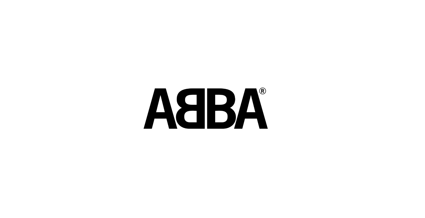
The design of ABBA's official logo, featuring the reversed first 'B,' was created by Rune Söderqvist. It made its initial appearance on the French compilation album "Golden Double Album." This typographical choice marked a significant branding effort for ABBA, distinguishing the band in the global music industry. Rune Söderqvist's logo was not merely a stylistic decision; it became a distinctive emblem that strengthened the band's identity and marketing potential.
The logo's debut paralleled ABBA's rising popularity, as the band was gaining momentum with a string of successful hits including "Waterloo," "Mamma Mia," and "SOS." The "Golden Double Album" itself was a compilation that showcased some of ABBA’s most popular tracks at that time, capturing the band's evolving sound and considerable fan base. The inclusion of the new logo on this album aided in cementing ABBA's brand in the visual and auditory landscape of the mid-1970s.
This branding move had several ramifications. It provided a unifying visual that was easily recognizable, fostering brand loyalty among fans. The logo's presence on albums, merchandise, and promotional materials contributed to ABBA's cohesive international image. From a marketing standpoint, it streamlined the band's representation across various platforms and regions, enhancing the memorability and marketability of the band.
Sales data and chart performance from that period indicate that ABBA was on an upward trajectory, with their music resonating across different countries. The introduction of a consistent logo was a strategic maneuver that complemented their growing musical influence. In the realm of music merchandising, the logo became synonymous with ABBA's name, presence, and the cultural impact they were beginning to wield.
In conclusion, the introduction of ABBA's official logo with the reversed 'B' on the "Golden Double Album" was a pivotal branding strategy. It solidified the band's visual identity, contributing to their international fame and commercial success.
#ABBA #GoldenDoubleAlbum #IconicLogo #MusicHistory #MoofLife
Primary Reference
Untitled
Explore the Life Moments of